Health Bars - When and when not, to use them
So health bars are all over the place in games. Generally speaking, they indicate the relative health of a player or NPC. Games with a health metric, most often combat or damage based games; think FPS or TPS shooters, driving games where damage is a factor, and certainly MMORPG games, where team-based cooperative fights against low-health creeps all the way up to impossibly difficult bosses are a huge part of the game-play.
Game designers usually have a pretty good idea as to what health bars are used for. What is often missing, is an understanding of when not to use them. They aren't a panacea for all your combat/damage woes, and certain game types will be very much lessened by their presence. Here's a run-down on when to, and not to use, health bars.
Avatars Only:
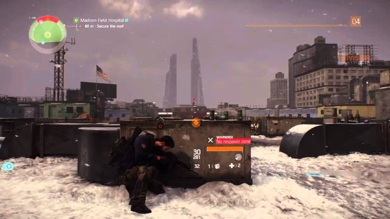
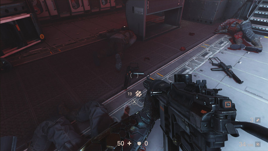
In single player or PvE combat games, where the relative health of the avatar far outstrips that of standard enemy AI. For example, in The Division Campaign Mode, your own character has a health bar, but friendly and enemy AI don't. This is for two reasons.
Firstly, the main character has much more health than enemies, so the meaning of health, the currency's value in the context of the game, would become inconsistent and unclear.
Secondly, the amount of damage needed to kill an enemy is small. Two to three badly placed, or a single, well placed head-shot, will do it. A moment to moment, granular update on the health of any given enemy, isn't necessary. Given that there is an element of stealth and tactical movement in The Division, and many games like it, having health bars floating above every enemy is going to tend to give away their positions to the player.
So health bars are all over the place in games. Generally speaking, they indicate the relative health of a player or NPC. Games with a health metric, most often combat or damage based games; think FPS or TPS shooters, driving games where damage is a factor, and certainly MMORPG games, where team-based cooperative fights against low-health creeps all the way up to impossibly difficult bosses are a huge part of the game-play.
Game designers usually have a pretty good idea as to what health bars are used for. What is often missing, is an understanding of when not to use them. They aren't a panacea for all your combat/damage woes, and certain game types will be very much lessened by their presence. Here's a run-down on when to, and not to use, health bars.
Avatars Only:
In single player or PvE combat games, where the relative health of the avatar far outstrips that of standard enemy AI. For example, in The Division Campaign Mode, your own character has a health bar, but friendly and enemy AI don't. This is for two reasons.
Firstly, the main character has much more health than enemies, so the meaning of health, the currency's value in the context of the game, would become inconsistent and unclear.
Secondly, the amount of damage needed to kill an enemy is small. Two to three badly placed, or a single, well placed head-shot, will do it. A moment to moment, granular update on the health of any given enemy, isn't necessary. Given that there is an element of stealth and tactical movement in The Division, and many games like it, having health bars floating above every enemy is going to tend to give away their positions to the player.
Avatars and Bosses:
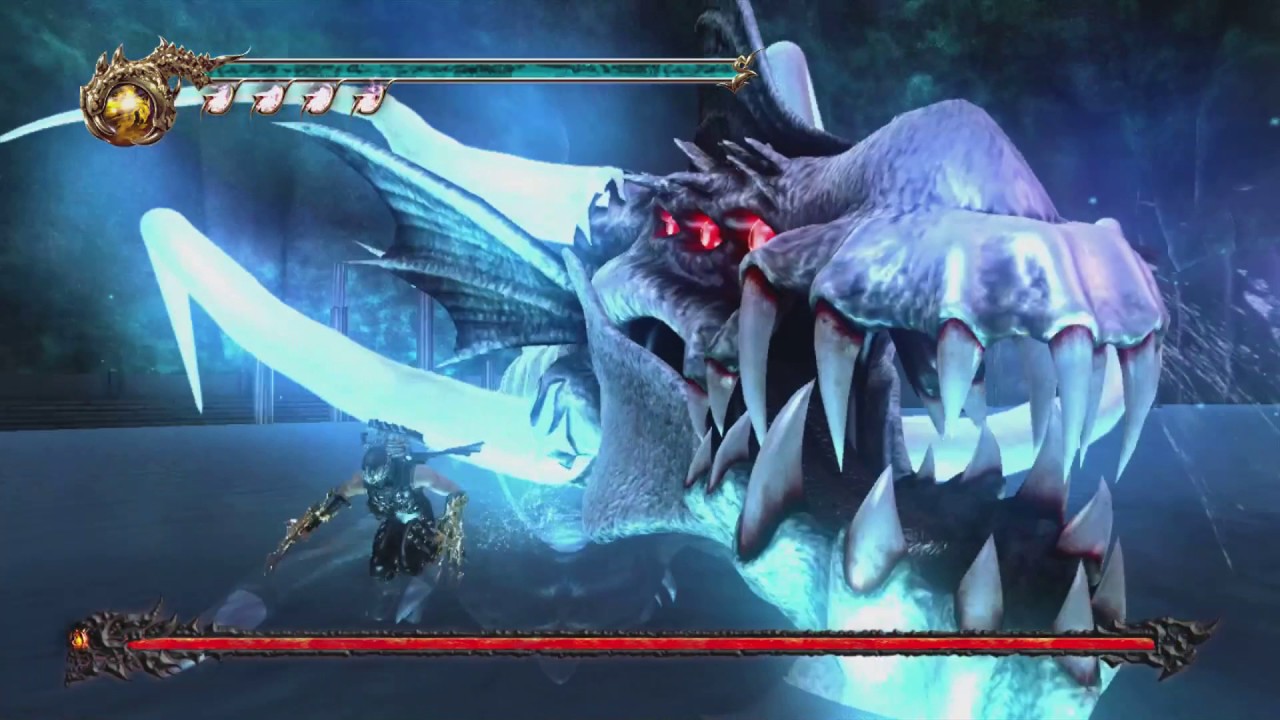
Another case to use health bars is when the relative health of avatars and enemy AI are more similar, usually in the case of bosses. Normal creeps, even mini-bosses, are unlikely to require health bars, but given that bosses may have much more relative health than the game's avatar, bosses may need them.
Consider the image below; a boss battle against the Water Dragon in Ninja Gaiden 2, the boss' relative health is considerably larger than the avatar. It will take many successful hits to beat it, as well as several minutes at least, and so tracking the moment to moment, incremental damage is useful and meaningful. If you observe combat between more average enemy AI found throughout the map leading up to each boss battle, you will find only the avatar has a health bar. Most enemies take between one and three hits to die, and so health bars are of little use.
Avatar vs. Avatar:
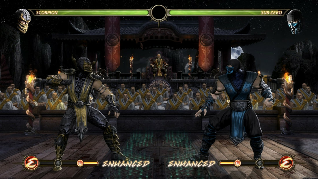
In PvP fighting games, both characters on screen need health bars. In order to balance such games, most characters are generally similar in health, but differ in speed, strength and unique attacks and defensive options. As below, in Mortal Kombat 9 - but of course there's many such examples, Scorpion and Sub-zero are, for competitive reasons, equal in health and general strength. To have any difference in health bars in terms of size or style, much less the rate at which they deplete, would seem unfair.
In PvP fighting games, both characters on screen need health bars. In order to balance such games, most characters are generally similar in health, but differ in speed, strength and unique attacks and defensive options. As below, in Mortal Kombat 9 - but of course there's many such examples, Scorpion and Sub-zero are, for competitive reasons, equal in health and general strength. To have any difference in health bars in terms of size or style, much less the rate at which they deplete, would seem unfair.
Cooperative MMOs:
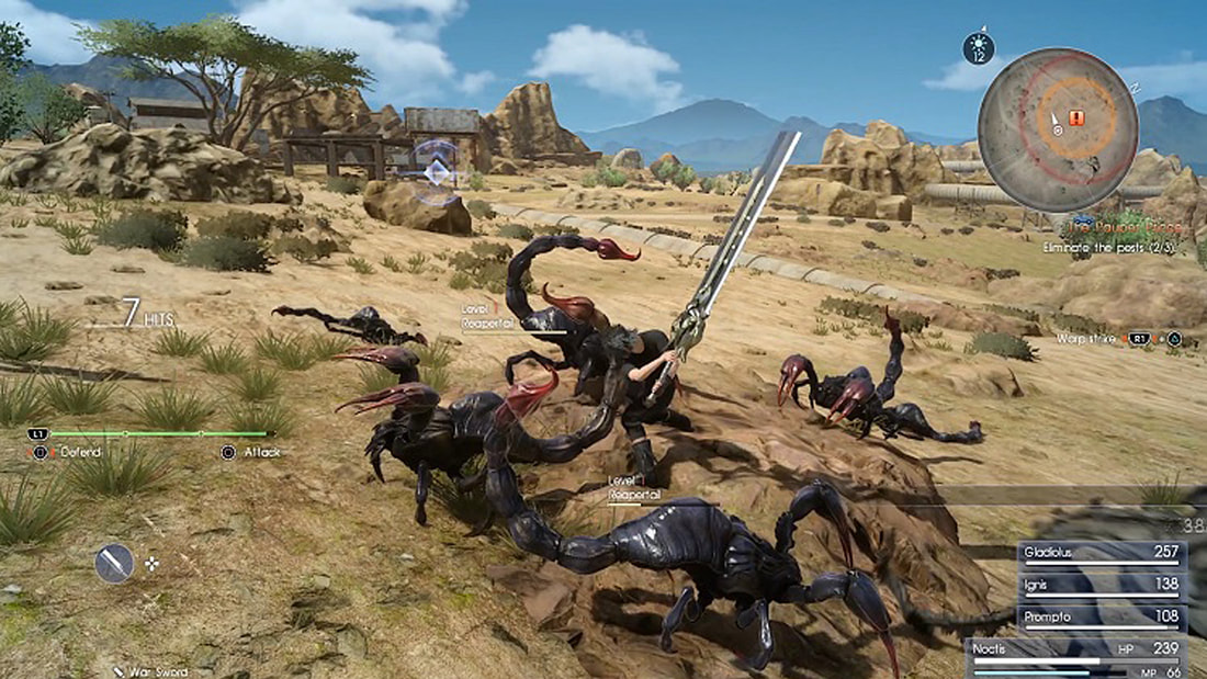
The final, and most common appropriate usage for health bars is in any form of co-operative MMO - whether it's strategy, combat/MOBA, RPG or some fusion genre. If you are playing as a single unit, whether PvP or PvE, being able to track the health state of each of your team members is critical, especially if you have a healer class or similar mechanic.
As can be seen in the image from Final Fantasy 15, even if playing with AI team-mates, it's critical that the player understands how well each team-member is doing. And, in this case, the enemy AI will take many hits before dying, and so they to, require health bars.
When to Avoid Health Bars:
So, logically, you should avoid health bars when the factors listed above aren't present. After all, they're distracting, inherently gamey and so immersion-breaking, and will be indicative of the mechanics and game genres in which they commonly appear.
So, if your game is focused on PvE game-play, with enemies that take no more than three standard, or possibly one critical hit - head shots for example - to kill, there's really no point in having floating health bars above each common enemy. Lengthy boss battles, as in Ninja Gaiden, may be the exception.
If there is an element of stealth, and the possibility that enemies can lay in wait, again, health bars do more to undermine your game play than they do to support it. If there is no cooperative element, as in a party brawler, especially if deaths and respawn rates are high and an inherent part of the game flow, health bars are of little use.
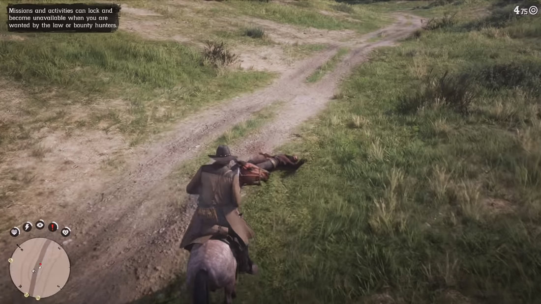
Take a look at the example below, from Red Dead Redemption 2. Given that this is a single player, PvE experience, where damage and death is quick for both the main character and enemy AI, health bars would be a cheap and inelegant solution to the problem of understanding your and your enemies' health. Instead, RDR2 provides meta indication along with animation and voice-over, which is exactly what should be done whenever possible.
In summary, game design students in particular, seem to relish placing distracting, immersion breaking health bars over every single common enemy, and a PvE platformer or top down shooter ends up looking like a massive boss battle from WOW, to the point where you can barely identify the avatar, most of the environment is covered, and the entire screen is just a mish-mash of incomprehensible UI noise. Three hits or less, no health bars. Quick deaths and respawns, no health bars. No need to track health of other characters, and nothing you could do about it anyway, again, no health bars.
So, logically, you should avoid health bars when the factors listed above aren't present. After all, they're distracting, inherently gamey and so immersion-breaking, and will be indicative of the mechanics and game genres in which they commonly appear.
So, if your game is focused on PvE game-play, with enemies that take no more than three standard, or possibly one critical hit - head shots for example - to kill, there's really no point in having floating health bars above each common enemy. Lengthy boss battles, as in Ninja Gaiden, may be the exception.
If there is an element of stealth, and the possibility that enemies can lay in wait, again, health bars do more to undermine your game play than they do to support it. If there is no cooperative element, as in a party brawler, especially if deaths and respawn rates are high and an inherent part of the game flow, health bars are of little use.
Take a look at the example below, from Red Dead Redemption 2. Given that this is a single player, PvE experience, where damage and death is quick for both the main character and enemy AI, health bars would be a cheap and inelegant solution to the problem of understanding your and your enemies' health. Instead, RDR2 provides meta indication along with animation and voice-over, which is exactly what should be done whenever possible.
In summary, game design students in particular, seem to relish placing distracting, immersion breaking health bars over every single common enemy, and a PvE platformer or top down shooter ends up looking like a massive boss battle from WOW, to the point where you can barely identify the avatar, most of the environment is covered, and the entire screen is just a mish-mash of incomprehensible UI noise. Three hits or less, no health bars. Quick deaths and respawns, no health bars. No need to track health of other characters, and nothing you could do about it anyway, again, no health bars.
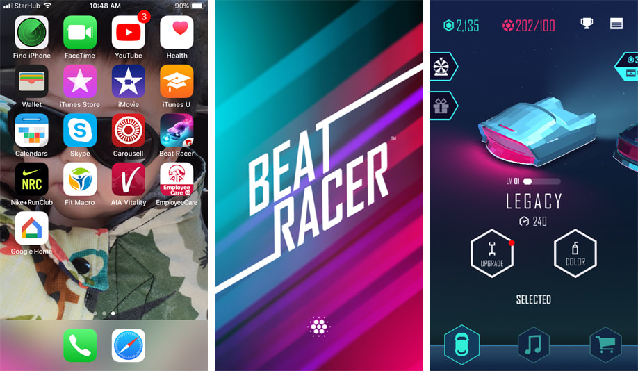
Beat Racer, Lila Soft Inc. 2016
Beat Racer is a driving based rhythm game developed by Hong Kong game studio Lila Soft. It's a great example of simple, intuitive but highly addictive game-play matched with a multi-path stream of revenue strategy. In terms of monetization, there are micro-transactions, freemium content and optionally viewed in-game ads, each one providing benefits to, and revolving around the central themes of cars, driving and music.
There's no real narrative or main character, just a series of player controlled - and I mean controlled in the loosest sense of the word, vehicles, endlessly driving along a mostly straight pathway, occasionally blocked by spiked obstacles or pursued by various not especially threatening enemies. Along the way you pick up boosts, coins and accumulate points based on obstacle avoidance.
I'll be crossing back and forth between the trifecta of aesthetics, mechanical and/or UX systems, and monetization. If there is a global message here, it's that these are not separate disciplines or systems, but part and parcel of the same unified whole, feeding back into each other as means of mutual support.
The Start Icon probably breaks a few mobile icon conventions, in that it doesn't use a simple silhouette or flat design approach, but shows a tiny image taken from a pre-game cinematic. The point of a desktop icon for a monetized game or application is to get people to press it - the key to this is less to be right, but to stand out. Sometimes, when everybody else is following the rules, even ones recommended by the OS or device manufacturers, it makes more sense to break them just enough to be noticed.
In terms of systems, Upgrades provide functional benefits in terms of speed and strength/armor, Color is just that. Both offer a variety of standard options, as well as unique options that can be purchased both with IGC won through successful gameplay and RWC through credit card or PayPal.
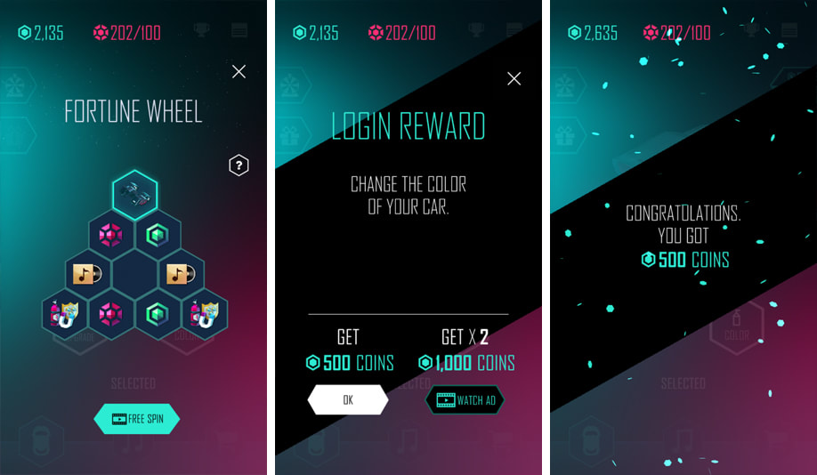
There is a vague gambling aspect with the fortune wheel, which allows an additional free spin if you watch a video advertisement. The same is true for changing car color. Video advertising is all optional however, and the same virtual items can be earned through game-play. IGC Coins are generously provided on each new login and at the end of every game, even when you fail to complete a level.
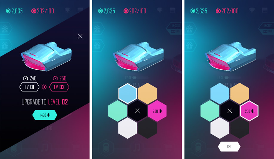
In terms of UX and UI, interaction patterns and so on, simplicity and ease of use are preferred over user control and depth of options. A wheel interface is provided, which works easily for understanding and applying overall color on the vehicle, but is limited in terms of scalability - you can only fit so many large, easily selected hexicons in a circle UI. Considering that Beat Racer is selling colors, it might have made more sense to provide a more scalable system which would allow more than six options.
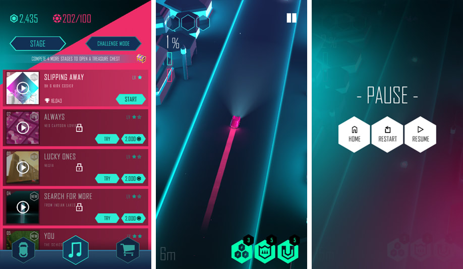
Since Beat Racer is a music focused rhythm game, as much as a driving game, there are a wide selection of musical options. The genre tends to be down-tempo electronica, which suits the cool, glowing, Tron-esque aesthetic. All the music can be tried once in a corresponding level, which is an under appreciated marketing tactic; let people try before they buy.
Controls are swiping to move left or right, tapping once to jump, and selecting one of three abilities via HUD buttons, each of which helps you overcome obstacles in a visually engaging but not meaningfully tactical fashion. There's a tutorial when you first play, but honestly it's not really necessary.
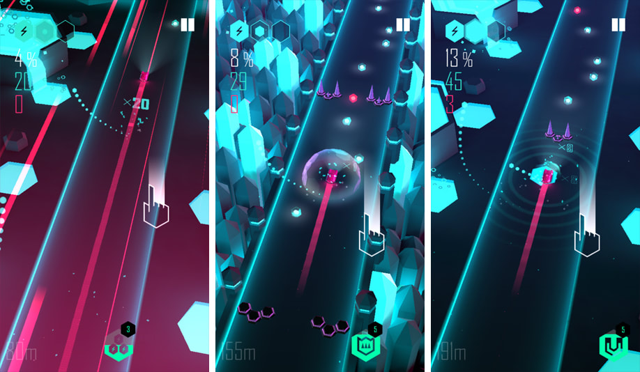
Given the simplicity of controls and gameplay, aesthetics and feedback are really where Beat Racer shines...pun intended. The environment is minimal and close to abstract, serving primarily as a canvas for the nearly overwhelming and really very dazzling feedback, visual effects and aural beauty. Beat Racer is a genuinely beautiful game in every sense. Despite a lack of any real narrative, this combination of beauty as a game design virtue creates a world that the player is eager to enter into time and time again.
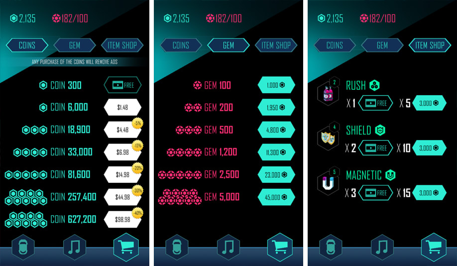
Perhaps the most distracting aspects are the monetization systems. As stated before, they are threefold; micro-transactions, freemium content and in-game advertising, and they're kind of everywhere, all the time. The game does allow earning of IGC through gameplay, and at a payout rate that is generous to a fault. Given that Beat Racer is a single player experience, only competitive - if at all - through asynchronous leaderboards, even those aspects that are pay-to-win aren't really a big deal. It's just that they're there, and must be confronted. With so many options, the UX intelligibility can be undermined. It might have been better to provide less, not more, options for payment, losing some player control but gaining clarity of navigation and reduced cognitive load.
Since most items can be acquired through any of the four methods as seen in the image above, if players really want a given item or locked content, they can earn coins through game-play, or purchase premium currency (Gems) through cash transaction, or watch a video, or some combination of the three. Beat Racer really has one of the most accommodating and flexible monetization strategies I've seen in a mobile F2P game to date.
Beat Racer is a well conceived and executed free-to-play, intelligently monetized mobile game experience. Visually and aurally stunning, incredibly consistent and highly polished, intuitive to control yet very challenging mid-to-long term, and with a monetization system that seems to cater to every player type without being heavy-handed.
If you're looking for a mobile gaming experience that is visually and aurally captivating, hypnotic and mesmerizing, easy to learn, challenging to master, where you can spend money or not, I recommend checking out Beat Racer.
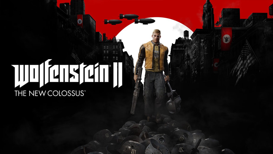
Wolfenstein II: The New Colossus
Warning: Spoilers ahead. This is a game where you shoot giant Nazi cyborgs, do you really think plot details are that important?
This time I'm taking a look at the UI in one of the better narrative, single player shooters to come out in quite a few years. Probably the best of the genre since its predecessor; Wolfenstein: The Old Blood. The game is set in an alternate 1960's where the German Nazi regime won WW II thanks to powerful technology developed by Wilhelm Strasse, AKA General Deathshead.
In Wolfenstein I, the series' protagonist BJ Blaskiwitz kills Deathshead, damaging, but not ending, the Nazi occupation of most of the world. Hitler of course, survives, albiet as a senile and badly aging puppet leader, with little actual control over his empire. The true mantle of power is in the hands of former work camp administrator and creepy sadist; Frau Engle.
What tends to define Wolfenstein II is much of what defined Wolfenstein I, in that there is very little that can be considered novel. This isn't a game that seeks innovation. What it does do, however, is take every cliché and well trod trope, every classic FPS mechanic, and do each of them exceptionally well. You won't get anything new here, but you will get traditional AAA game design of the very highest quality.
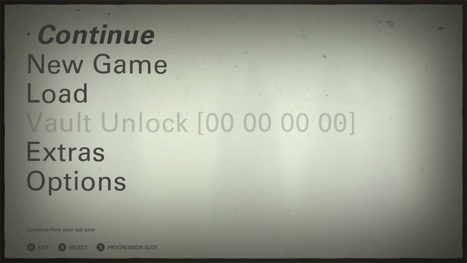
The UI then, is no different. The visual theme is cleverly set up around propaganda films of the 1930's, with a sepia tone colour palette, slightly shaky idle animation remenecent of the way film in early projectors would move slightly as it rolled through the wheels, and dust and scratches common in cheap and poorly handled movies of the era. That theme and consistency of art direction is about as ground-breaking as you're likely to get here, and that's actually pretty great.
Fonts are large, sans serif and readable. There's no skeumorphic buttons or flashy animations, which I suspect, would have made the UI feel far too contemporary. This is a world without anything but the most basic computers, so visual style pulled from the world of digital games or mobile UI would have felt out of place.
The feature set is pretty dense, with a wide selection of sub and tertiary mechanics that require UI support. Multiple save slots, progression and performance stats, collectibles and many more sub-systems are at play. From a game design perspective, where you'd ideally integrate each system, this might be where the game starts to break down a bit. It's still an excellent game, but there's just so many things (of relatively minor importance) to do, collect, manage, hack or mini-game, with often little systemic relationship with the core mechanic, that a lot of them seem like superfluous distractions.
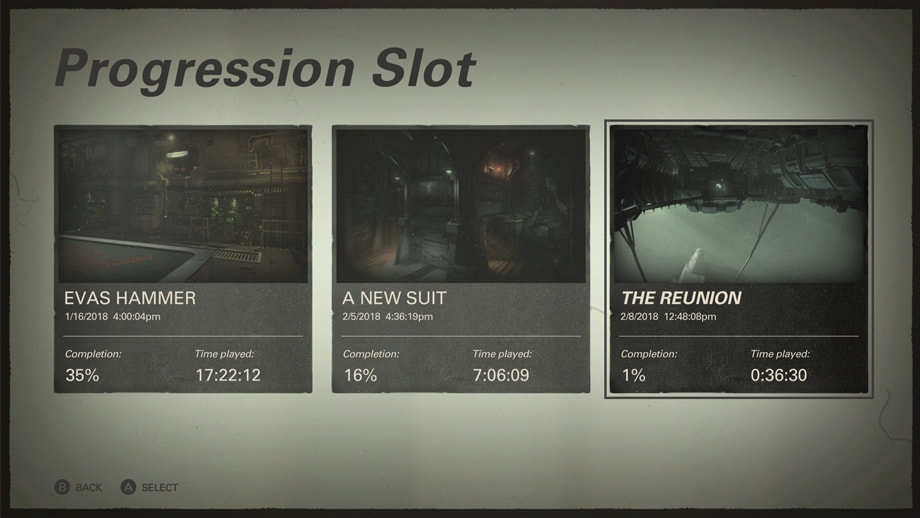
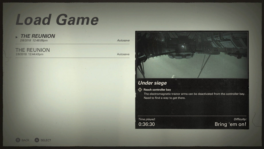
For example; I'm not sure that Time Played is really worth knowing. It doesn't help a player make decisions, or motivate behavior in any way. There's a lot of things like this; from Star Cards to Recordings, Toys and Concept Art. Fun the first few times, but quickly falling to the wayside in favour of the core gameplay experience and thereafter, ignored.
The humour in the game is consistent and using Blaskowitz's beat up face as a kind of icon of difficulty level is a nod to classic Wolfenstein UI. In a game full of grotesque torture scenes, sadism, racist genocide and totalitarian fervour, the goofiness of this aspect of the UI seems out of place to me. It's there of course, to take the edge off of all that bleakness and murder, but it still seems weird.
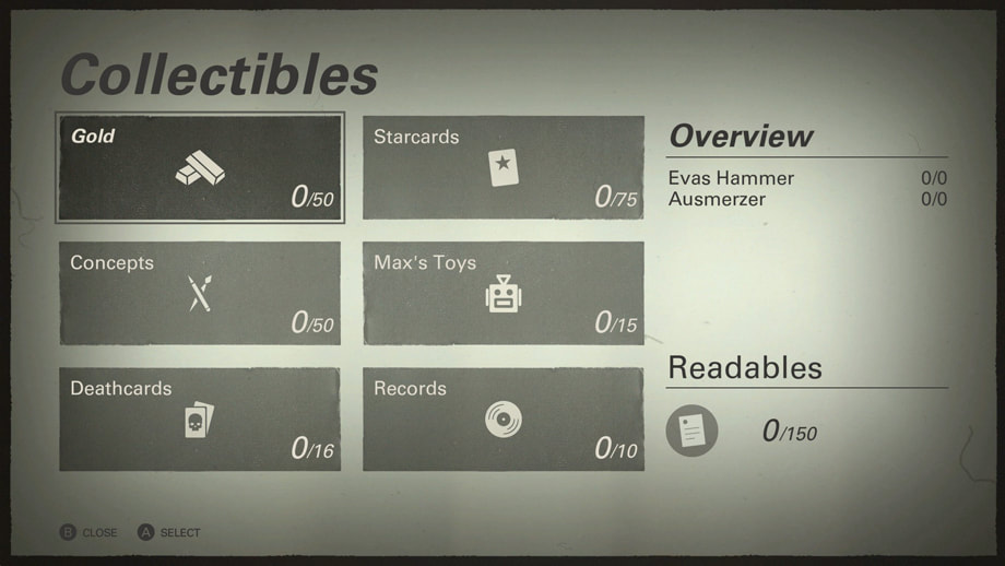
Speaking of sub-mechanics and arguably distracting features, the Collectibles system seems like it's just too much. The UI is well laid out, with a rigorously enforced grid structure, and like all other screens, consistently follows the art direction. I just wonder if non-functional (they don't actually help me play the game better) items like Starcards, Concept Art, Toys and Records are appropriate from an information architecture perspective, given that they're placed next to Gold, a functional game currency, and Deathcards, which allow you access to the Enigma Machine, a code/puzzle hacking system that unlocks a large body of mini-mission content.
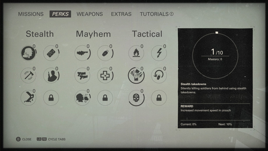
Here though, we've got a well connected system of Perks, which are really just a stats tracking and reward system. Why I say well connected is that Stealth, Mayhem and Tactical represent an organized family of game-play types, each of which is implicitly and explicitly represented in the mechanics, map design, weapon and device design.
Each major room has a very clear suite of activities, items and weapons, and the placement of these correspond to areas of that room best suited for each Perk category. Avoid direct combat by crawling through a sewer drain, you'll find opportunities and items related to Stealth, go straight ahead, guns blazing, and the same will be true for Mayhem's items and opportunities, and sneak along an overhead scaffolding to find items and opportunities related to Tactical game-play, then go back and do it a completely different way.
Each major room has a very clear suite of activities, items and weapons, and the placement of these correspond to areas of that room best suited for each Perk category. Avoid direct combat by crawling through a sewer drain, you'll find opportunities and items related to Stealth, go straight ahead, guns blazing, and the same will be true for Mayhem's items and opportunities, and sneak along an overhead scaffolding to find items and opportunities related to Tactical game-play, then go back and do it a completely different way.
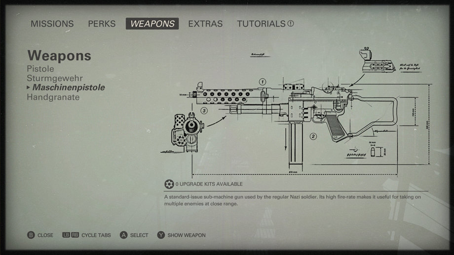
Weapon upgrading is a simple system, with weapon upgrade points being an in-game item that can be spent in the UI. Most weapons only have 3-4 upgrade slots, with 3 completely linear levels each - the next scope, magazine or ammunition, and permanent once applied. No deep customization or personal configuration here. That being said, each upgrade is immensely satisfying in-game, and adds a lot to a given weapon's profile.
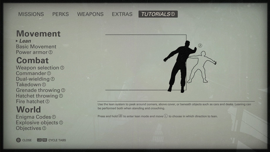
The UI approach, as in the image above, looks like a schematic or blue-print that might appear in a WW II instructional book for soldiers, and so fits with the theme. There's something beautiful in the precision of a cleanly drawn technical diagram that a photo or 3D model couldn't capture.
The UI approach, as in the image above, looks like a schematic or blue-print that might appear in a WW II instructional book for soldiers, and so fits with the theme. There's something beautiful in the precision of a cleanly drawn technical diagram that a photo or 3D model couldn't capture.
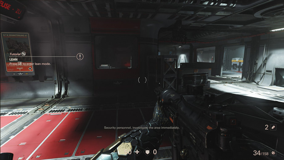
The UI provides a similar approach to game-play help, although from a gamer perspective, much of it isn't really necessary. If you've ever played a standard (or classic) modern console shooter - Halo, C.O.D etc. the control scheme and general movement mechanics will seem intuitive.
A less satisfying aspect of this system is that each time the game introduces a new movement or combat sub-mechanic, even if you've already figured out how to use it, you get an alert prompt in the HUD. Given that the controls are so intuitive, I didn't need a lot of extra help, but doing the action isn't enough. Until you pause the game and view the corresponding tutorial in full, the prompt on screen and in the tutorial text in the front end UI will just keep blinking.
"View the tutorial or I will annoy you FOREVER...."
Yours Truly
- The Game
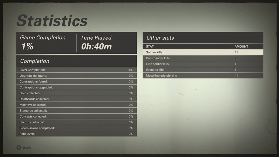
My general approach to stats displays is that regardless of what you collect, you should only display data that motivates player behavior you want. Since there are a variety of other ways of motivating a lot of the less critical game-play behaviors; Upgrade Kits let you upgrade, Gold can be spent on items etc. the stats on the above screen seem a bit overwhelming, like an all you can eat buffet with 100 kinds of cheese, but you can't find the damn crackers. I would have displayed 3-4 key stats most players, most of the time, will be interested in, and that centre around the core mechanic of shooting and melee combat, and hidden the rest in an "Advanced" section for those intrigued by statistical minutiae.
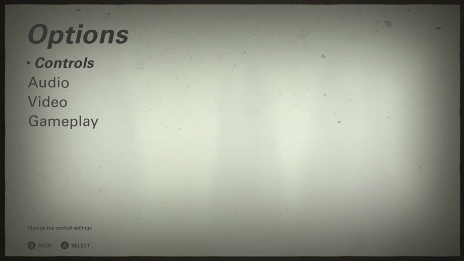
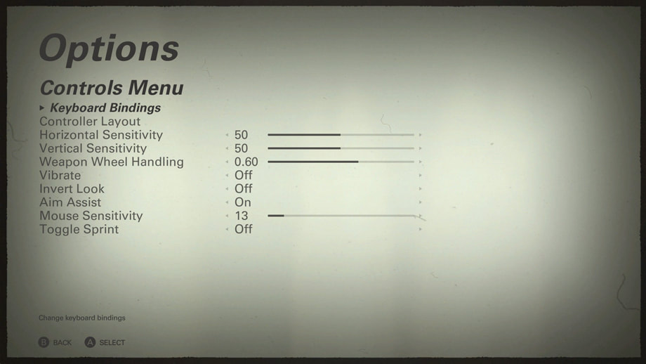
All of this is pretty standard, but it would be nice to have a quick way of testing each option, particularly sensitivity options, as these can really effect game-play. Going in and out of the Pause Menu, making micro-changes and thinking "well that sucks" each time can get laborious pretty quickly.
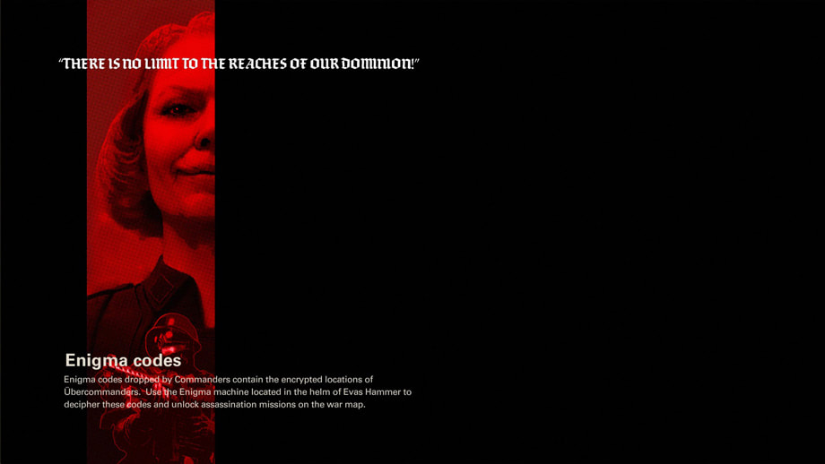
Maybe some readability issues here. They probably should have moved the tip text off the image, or removed the soldier at the bottom, or both. Text over images needs to be done with caution. The background image is also generic and not connected in any way to the content. To take the example above, Enigma Code cards have a specific icon, and appear floating over dead Commanders. Showing what that looks like would have gone a lot farther than a random and unrelated background image. The same is true for all other loading screen tips. Show first, explain second.
The HUD and in-game prompts are generally minimal and clear, although from a stylistic perspective, it does feel more slick and spindly as compared to the heavier front end UI. Sometimes, the text is hard to read when over more complex objects, and in general, it seems closer to a Destiny or Call of Duty: Infinite Warfare than the gritty, industrialized world in which Wolfenstein II takes place.
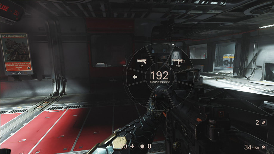
I'm not usually a fan of weapon wheels unless they pause the game. This one does, so I give it a pass. In cases where they don't; Far Cry 4 for example, using a weapon wheel UI in high-stress combat is ergonomic torture. Even this one can be irritating when trying to carefully select an item, and in worst case scenarios, I've selected an incorrect and close-to-useless item without realizing it, closed the interface, only to find that I'm facing a 2.5 metre tall super soldier armed with an empty sub-machine gun, and not the fully loaded shotgun I expected.
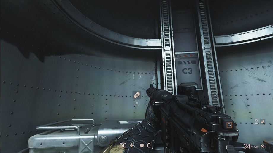
One thing I can't figure out is whether or not there are automatic pick-ups. In Wolfenstein I, there were no auto-pickups of items. You always had to press X. In Wolfenstein II, it seems like with some items; grenades as shown above for example, you do, but for other items; batteries for certain electrical weapons, you don't - I think. I keep hearing the pick-up audio feedback when moving through piles of dead enemy AI, where presumably there's a lot of items to pick up, but the UI isn't clear in telling me what I'm getting. There's just a lot of clicking and icon flashing going on.
Pick up some bullets...although not all ammo will work with every weapon, and the ammunition icons tend to undermine their specificity, and so clarity, in attempting to be generalized in style.
So maybe I can pick up health, sometimes, I think.
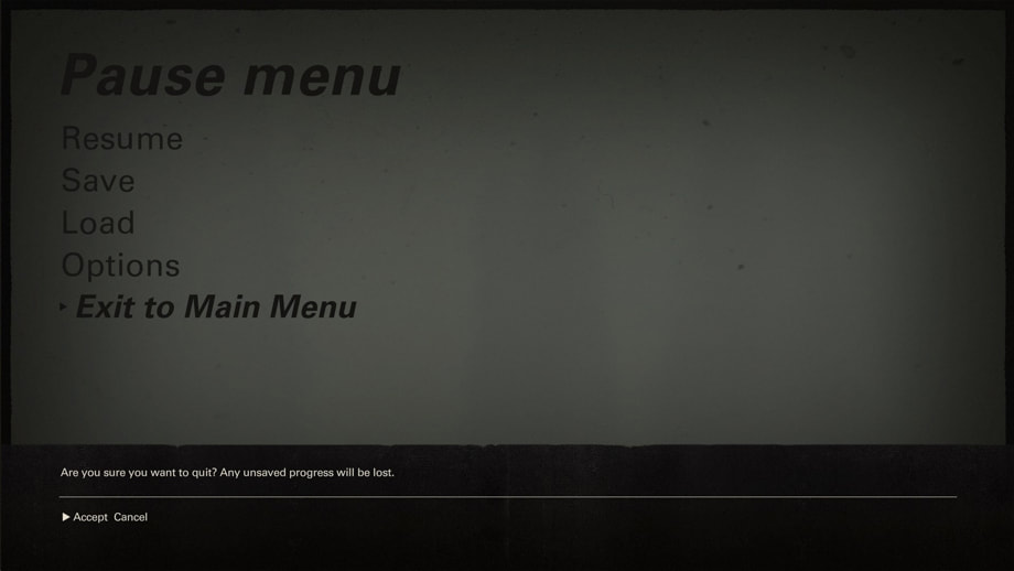
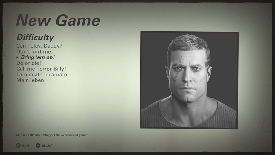
The Pause Menu is, like most things in Wolfenstein: The New Colossus, standard of such games. As mentioned earlier, the game specializes in doing the same old things as every other game, but doing it very, very well.
Confirmation dialogs are simple black bands with white text. Having Accept as the initial focused option for some of the riskier processes - in this case, potentially losing your unsaved progress, isn't what I'd usually recommend. My preferences is that whenever a process can lead to the player losing something; saved progress, money, I assume they've made a mistake and make the intitial focus Cancel/No. If there's no chance of losing out, I assume they know what they're doing, and make the default focus Accept/Yes for ease of use.
All in, Wolfenstein: The New Colossus is a fantastic game, with a very well thought out and effective user interface approach. Although it never sets out to re-invent the genre, its undoubtedly one of the best in the class. There is a great deal to learn here about how to implement a visual theme without falling back on gimmicks and how form should follow function, especially in an age of highly decorative, eye-candy game UI - Persona 5 I'm looking at you. As with its predecessor, this game is also a master class in narrative game-play, player engagement, replayability and level design. If I gave out stars, Wolfenstein II would get 5, or 10, or whatever the most is. Fine, 100. 100 stars for Wolfenstein: The New Colossus!
Marvel's The Defenders / Netflix / 2017
This time, I thought I’d do a post more related to the link between narrative and colour, particularly communication of characters. If you haven’t seen any of Marvel’s Avengers; warning, there a few mild spoilers below. You have been warned.
The eight episode super-hero series, developed by Netflix and set in the Marvel Universe shortly after the events portrayed in the most recent Iron Man/Thor/Captain America movies, uses primary and secondary colours, along with white and black, to clearly separate each character’s individual narrative. This is made explicit in the opening credits, but is interwoven more subtly throughout the main storyline as well.
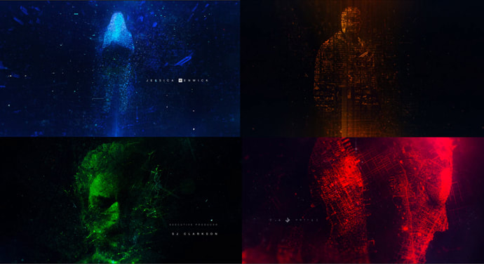
Here we can see each character’s section of the opening credits sequence. Jessica Jones is shown in blue, Luke Cage in gold, Iron Fist in green, and Daredevil in red.
Also notice that they meet up and form a team in New York, and underlying the images is a high-contrast map of New York. It creates and ultimately dominates, like the scaffolding within a building, each character, and all other aspects of the narrative.
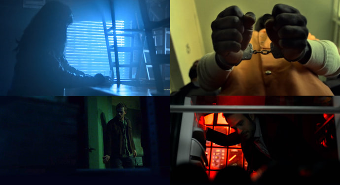
Here, colour is more than just an attractive way of segmenting an intro sequence. The set direction, costuming, cinematography and post-production treatment use each character’s colour as a constant point of reference. When Jessica Jones’ individual narrative is being told, blue light beams through windows, both her and supporting cast's clothing is largely in blue tones and so on. Luke Cage is introduced wearing an orange prison jump suit, the walls are reflecting yellow light, and everywhere he goes, yellow follows. The Iron Fist seems to be operating mainly at night, in seedy areas of New York bathed in eerie green, usually wearing a grungy green shirt and jacket, and Daredevil is always surrounded by varying levels of deep red, with red accents on his tie and home decor.
This is more than aesthetics. It also helps to communicate the fundamental nature of each character – their core emotional mechanic under which each operate. Jessica Jones is chronically depressed, anti-social and bordering on alcoholism. She is metaphorically blue. Luke Cage is a working class hero, an everyman who aspires to uplift his struggling community; a classic good-guy with a heart of gold. Iron Fist has a kind of “spirit of the earth” super-power, and his intentions are more meta-physical and less clear cut. Raised in what is essentially a parallel universe, and often lost as to how to operate in the modern world, green is indicative of his alien nature. Finally Daredevil is, despite his best efforts, addicted on some level, to violence. He doesn’t choose to act heroically through purely good intentions, but because, fundamentally, he enjoys hurting bad people. The colour red; of anger and the blood that comes with it, is in his nature.

So a team of super-heroes need an appropriately menacing super-villain. Sigourney Weaver plays Alexandra, a leader within the criminal organization; The Hand. In her intro scene, she is shown bathed in white light, wearing an expensive looking white smock, surrounded by the white walls and lab-coats of a hospital.
A secondary, slight blue tint adds an aspect of silver, with black as an accent. You can see the same white and silver behind her in the hospital fixtures, and later in her expansive condominium apartment. When you see the lighting become cold, white and high-contrast, you know her character is dominating the situation, even if she’s not actually on screen. Her influence can be seen and felt in her stead.
And, although she doesn’t have a personal vignette in the opening credits, her colour does appear.
Silver-white is the actual colour of the main title graphic, with the other four colours surrounding and laying over it. Blue, gold, green and red seem like gadflies set against the dominating white of the letters. They only come together and exist in white’s context.
As a character, Alexandra is free of emotional or moral entanglements. Often, black is used to indicate villains, but of a chaotic and unhinged sort. Alexandra is not that kind of evil. She supremely Machiavellian and without remorse; a representative of the desire for absolute control over each detail, both of herself, and the world around her.
Take-aways:
Colour is a powerful way to communicate narrative meaning and influence your player’s emotional state, and shouldn’t be overlooked. In the scope of a game, it may not be necessary to have so many coded colours, since you rarely have this many characters who are critical to your gameplay narrative. However, even a player-controlled main character, and a final boss antagonist can have diametrically opposed colours representing their fundamental nature.
You can use colour to foreshadow or indicate influence in a more subtle way than ham-fisted explanation and time consuming cut-scenes, to establish allegiances or connections, to distinguish characters or environments (Daredevil is surrounded by the most intense red at home), enhance communication of gameplay direction, and as a major element of a unified visual language. It should go without saying that this approach can and should, inform your UI colour choices as well.
The Division / Ubisoft / 2016
Overall, I like what The Division UI does. It takes a huge page out of the flat design playbook, largely popularized by mobile os, app design and experimental AR. It is very, very complicated in places, with a great deal of data pushed at the player. Despite this, it manages to make many complex systems workable, is almost militant in consistency, and very much focused on employing a minimalistic visual language in all instances.
Intro Flow:
Character creation is fairly superficial. Although there is a high level of both breadth and depth, it’s vanity from start to finish, so no choices have any gameplay effect. Given that The Division has in many respects, an RPG feel, more meaningful choices would have been nice here.
The actual flow is pretty simple, with a top menu of categories, a left of screen selection menu for sub-options, and pretty fantastic character models right of screen.
It’s a perfectly fine system if you’re into visually customizing characters. I just wish there was something deeper than hair style and facial scars, clothes and so on.
HUD:
The HUD has a lot of content floating around, and although stylistically it’s beautiful, functionally it tends to become distracting. There are multiple levels of redundancy in terms of controls display, and the augmented reality approach means character level, health bar accompanied by a numerical data display, current objective and help text, waypoint indicator, mini-map and in the earlier stages, controls instructions and so on, are all floating around the main character most of the time.
I’m not usually a big supporter of real world simulation as your key immersion mechanic; I find it superficial and usually an excuse for shallow game mechanics, but if that’s what you’re going for, and The Division definitely is, don’t constantly break it with HUD floating over, around and within, the game environment. This is especially problematic in-doors, where the HUD now competes with spatial X to interact tooltips and other icons meant to give you clues as to what you can manipulate, who you can talk to and so on. Then you’ve got the environment itself behind, with all its visual complexity, interacting and interfering with, the two visual layers of interaction UI and HUD UI above.
The minimap is, like everything else, minimal in what it conveys. It's not super helpful, but it's not too distracting either. I honestly didn't use it much, relying on floating waypoint markers and level design to guide me.
Front End:
Something that stands out is the policy of having a minimal color coding system. Non-interactive UI elements, like screen titles or data display text, are white, with a slight drop shadow for readability. Selectable text has a dark underlay set at about a 25% alpha, with mouse over and selected states visually changing the button in terms of Z position and color – they move forward and turn orange, and inaccessible or locked elements are a muted purple. Small rectangles of green to the side of menu buttons serve as additional highlights.
The orange highlight color is overused in that besides communicating “click here”, it also indicates “look here” or “this is important"; items running the gambit from location data and keyboard mapping to level bars, health bars and alert icons. Most of these elements aren’t interactive, and so you’ve got a situation where a given screen has 10 or more little orange elements, some are interactive, some aren’t, some are critical and actionable, but most are tertiary and not very important short to mid-term. Mixed messages about what the orange highlight even means undermines clarity of communication.
The inventory and weapon customization are generally good, although lack of full comparison, particularly with mods, is irritating. Viewing of many items is impossible unless you select and exit back a screen, so you’re choosing a lot of vanity items by name (in the screen shots provided this is "Simple Jacket - Brown"), and not something you're seeing displayed on the character model or in thumbnail form, which seems to undermine the entire purpose.
Screens are well laid out, strictly adhering to modular grid structures and using a consistent visual language and interaction methods from screen to screen. However, inventory items often have so many data points on display; name, DPS, cost, level and more, competing for attention with icons and your personal stats as well as general screen info like title and controller buttons, that hierarchies inevitably become excessively combative; bereft of any real sense of gestalt.
Stylistically, everything is beautifully austere, but seems to side with the aesthetics of minimalism rather than functional reductionism, and on that, you will never get me to agree.
Map:
The map is well designed, generally. It's aesthetically attractive, functional in its basic form, and shows enough of the landscape without undermining the challenge of navigation gameplay. There are 20 possible map icons; from the player's own position to a host of mission types, activities, friendly AI, safe houses and so on, which is a lot. You can also put down waypoint markers and toggle GPS. Each individual piece of data is a nice addition, and the map does have a legend, which is pretty well designed. Map legends, however, are usually a sign that things have gone off the rails in terms of content and complexity, and that's very much the case here. I'm a big believer in structuring your information architecture around worst case scenarios, and under those conditions, when you've got at least one of each icon in play, the map becomes a bit of a mess.
Environment and Gameplay:
In a semi-open world tactical shooter like The Division, environment and level design become gameplay mechanics in themselves, and overall, I’m not a huge fan of this game’s approach. It’s not that it’s badly done. In fact, it’s visually stunning in its attention to detail. The problem for me is that it’s often too realistic, and as a result, bounces between boring and confusing.
Playing as an elite sleeper agent tasked with re-establishing order in a post-pandemic New York should be interesting. I do love me a good apocalyptic shooter, especially one with stealth and cover mechanics matched with an engaging narrative. And yet, getting lost on side streets, continually passing the same abandoned lot or turned over dumpster, seeing the same graffiti, all rendered with a loving attention to every ugly detail, isn’t that engaging.
Modern New York, especially those areas on the lower economic spectrum, is depressing. Where I want an element of the fantastical, there’s just poor people shuffling by in the cold. No zombies, aliens or genetically modified super-soldiers to battle here, no epic level of destruction hinting at a dark secret to uncover. Not even a futuristic city-scape littered with floating cars and gleaming high-rises. Just a modern American city rife with poverty and urban decay, emptied of all but homeless looking petty criminals, predatory street gangs and nameless rogue agents as gun-fodder. Emptied by smallpox no less – a banal real-world infection that at one time, killed tens of thousands of people every year, most of them children. Gritty and true to life? Absolutely. A world I want to be a part of? Nope, not really.
Summary:
The Division features some of the most consistent examples of flat, minimalist design in contemporary game UI. Taking inspiration from near future sci-fi like Minority Report and Iron Man, as well as real augmented reality projects like Google Tango, Microsoft HoloLens and the work being done at the MIT Media Lab, the game delivers a user experience that is clean, consistent and free of decorative pretense. It’s cold for sure, but so is the game environment and gameplay. Flights of fantasy, and in my opinion, some amount of joy, is sacrificed for efficient, spreadsheet-like layouts, barely-there interaction feedback and complex data displays set against the gritty realism of a slowly dying New York.
For UX/UI designers, there’s a lot to learn, both in the good and the bad. The key takeaway for me, is to be 100% consistent in everything, except when you shouldn’t, then don’t.
Batman: Arkham Knight / Rocksteady Studios / 2015
So it needs to be said. Loudly. Batman: Arkham Knight is a really complex game. It's not so much the mission complexity or core mechanics, but the dazzling array of mechanics and sub-mechanics, weapons, items, abilities, combat options and so on. It's a great example of what can happen when a dev team, particularly GD's, are given the free reign and the full trust of the executives. You can get less of a game for fans, more of a game for other game designers, with mechanic nested inside mechanic, system inside system like a Batman themed Ukrainian Easter Egg.
The Good:
One key that stands out is the level of consistency, which really is an element of polish. The same font in various sizes is used throughout, in white, but at various levels of opacity, and at consistent screen positions. The animation style, timing and general approach of UI elements is used in every possible case, and only changed when necessary. The same thing can be said about interactions; with button style, animation and transitions being used in exactly the same way across the board, and only allowed to vary in genuinely unique cases.
Overall, the art direction, interaction design, animations and transitions are fantastic. Timing is excellent, following the general rule of enters easing out, taking about .5 sec, and exists easing in and taking .25 sec (the specific timing may vary, but this ratio is usually a good place to start when timing intro and exit UI animations). The rule of always having something animating, even if very subtle and in the background, is followed. This ensures the player never suspects the game is frozen or has crashed, and allows a sense of continuity even when transferring between structurally disparate screens.
The Less Good:
Screen hierarchies are generally pretty clear, but do tend to break down on more complex screens, of which there are many. The Rewards screen, the Settings screens and Gadget Upgrades include long lists of options, and are inherently complex systems. The screen layouts tend to suffer from too much information presented at a time, with little indication as to what is more or less critical.
The end result is that what could have been more intuitive and easy to use systems become puzzles in themselves. The one saving grace here is that they are mostly optional; enhancing game-play but not blocking it in any way. Still, it can be frustrating to find oneself in a screen, and have to go through the painful process of figuring out how it all works.
The HUD and in-game feedback works generally, but can be a lot of data coming at the player, all at once or in short succession. There is both a horizontal compass at the top centre of the screen, and a kind of radar bottom left, and having both seems redundant. I would have selected the radar widget and included the compass info there. Some of it is also very large - the reticle, XP and health bar, ammo bar and so on, are physically large, and with so many elements going on, it tends to block game-play and reduce immersion.
Summary:
In the end, Batman: Arkham Knight is an extremely well made game. The UX/UI is excellent, with a very high level of craft. Most problems are rooted in the fact that, fundamentally, Arkham Knight doesn't know what it wants to be. Stealth platforming, action/combat, puzzle platforming, narrative based detective story, adventure RPG, vehicle/racing combat and more, are all given close to equal weight at various stages of the game, often competing for precedence at any moment. Switching between the game's various mechanics and control schemes, especially during more intense moments of gameplay, was for me an exercise in cognitive overload.
It's still a fantastic lesson in how to create an AAA masterpiece, despite it's key fault of trying way to hard.
Borderlands 1 / 2009 vs. Borderlands 2 / 2015 / Gearbox Software / 2K Games:
As per a student's request, I'm going to take a look at some of the key UI screens in Borderlands 1, and compare them to Borderlands 2. I'll break down each screen, but have also provided short notes under each image for quick reference.
Borderlands 1 images are on the left, Borderlands 2 on the right.
Image 1 - Start Screen:
The start screen provides a good look at what's often wrong in Borderlands. The type treatment and general approach is inconsistent with the rest of the game. The background says virtually nothing about the game-play, and personally, neither the type, nor the background art get me particularly excited to play. At least Borderlands 2 doesn't show me an empty world where nothing is much is happening, and I'll probably just be lost and bored.
Image 2 - Modal Dialog Boxes:
Not much really changed from 1 to 2 except the slight banding in the background of the panel, and the change from simple black text on a yellow button to white text with a black stroke on virtually the same button. This doesn't seem to aid readability to me. The button in Borderlands 2 has a motion blur effect, which seems pointless and forces the button past the edge of the panel.
The keyboard prompts at the bottom of the panel do seem more readable in the Borderlands 2 version.
Image 3 - Main Menu:
Borderlands 1 seems to me to be very dated here, and can't quite decide what it is. Casual, sci-fi, post- apocalyptic, wacky comedy game or violent shooter. The large, really very obtrusive menu panel blocks most of the game environment, which is ugly, although considering nothing interesting is happening back there, it probably doesn't matter.
The prompt text at the panel bottom is blue on blue. It's visually weak and might not even be necessary, in which case, just remove it.
Borderlands 2, although slightly busy with the online data top right and promotional text bottom left, seems much more naturally integrated into the game. The background is still a boring, dirty wasteland, with no real indication of game-play though.
Remember that all primary screens preceding the game; Start Screen, Main Menu, Loading etc. are a promise to your players. You will have fun, and this is the kind of fun you're about to have. Borderlands, both 1 and 2, make me think I'm about to spend the next few hours picking up trash or looking for my car. I just don't understand their choices here.
Image 4 - Options Menu:
The differences discussed above are still present. Sub-menus in Borderlands 2 do provide a semi-opaque underlay to help create contrast between the yellow of on focus text and the yellow-brown desert background, which is a good touch. Beyond readability, this helps to visually separate the Main Menu from these deeper screens without changing other key elements too much.
Image 5 - More Game Options:
There really are a lot more options in Borderlands 2 than in 1. Those shown in the image are fairly straightforward, but as you get deeper into the audio and visual options, trying to tweak every option to optimize performance was confusing as I didn't understand what a lot of the options even meant. Until playing for quite a while, users won't be able to put much of this stuff in context, and it does effect frame rate and overall performance. Trading on or off? Who knows? Censor Gore? Um, why would I want to? Gunzerking Autoswitch? I don't think I have ever Gunzerked before...
At least I've heard of most of the options in Borderlands 1, although a lot of them are pretty niche and technical and probably overkill. Just optimize your game so I don't have to fiddle knobs to get it to work.
Image 6 - Online Options:
Not much changes here, although Borderlands 1 seems to give you an extra hint as to what you're doing there with the "Join an online game with your selected character" text. Unfortunately, the text alone isn't very helpful - it actually seems fairly obvious what I'm about to do, and at any rate it doesn't show me my currently selected character.
Image 7 - Host/Network Options:
Borderlands 1 makes the mistake of having multiple panels and pop-ups spawn over each other. Remember that each additional piece of UI is a further break in the immersion. I'd highly suggest always closing the previous overlay or pop-up before spawning the next.
Borderlands 2 isn't without some odd decisions. The yellow button has an inexplicable motion blur added to it, which pushes the graphic outside of the edge of the panel, and doesn't say anything about the game. It makes no sense. Also, keyboard prompt text (which would have been better served with some key graphics rather than just words "[Enter]" and "[Escape]"), are, unlike every other panel in the game, floating below, in empty space.
Image 8 - Loading Screens:
Here, Borderlands 2 seems to get things right. It's very clear where I am, what's going on, and what's about to happen in terms of environment and game-play. Loading is quick, so the tips text isn't always that useful, but I am given some guidance - again, a loading screen is a promise. I would like a loading animation of some kind to make clear that the process is still going on, and the game hasn't hung, but otherwise this works for me.
Borderlands 1 loading screens are generic. The loading is again pretty quick, so the tips fly by without being very actionable. The background graphics don't tell me anything about what's going to happen, and I'm forced to look at a small render of the still very boring game environment, free of any sign of life.
Image 9 - Character Selection:
Borderlands 1 uses an in-game selection system, where I get to see a nearly full model of each character, with overlay info on a separate UI panel. I find this system to be more immersive than Borderlands 1, and I'm not sure why they changed it.
Borderlands 2 uses a more conventional UI screen strategy, which, unlike Borderlands 1, should have allowed them to show the entire character model, unblocked by other characters and environmental elements, and yet, they only show a small torso in the corner, and tiny heads in a selection grid. Bad choice in my opinion.
Image 10 - Character Customization:
Neither Borderlands 1 nor 2 provides a lot of customization options. Borderlands 1 uses the same heavy panel style, with a static rendered character torso, which falls short of what most games were doing at the time. Since I can see the colours on the character, the large swatch panels don't seem to have much use, and I find myself ignoring them.
Borderlands 2 at least has a live character model with an idle animation so things don't feel so dead. Naming colours seems even more useless than giant swatches, and if delay time is the issue, a smaller grid containing all possible colours that I can quickly navigate would have been a better option. The tiny heads are also still less than the player deserves.
Image 11 - Initializing HUD:
This sequence is really a quick tutorial on how the HUD works. I never really understood why I would have a HUD explained like this in Borderlands. I'm not a robot, or wearing a mask that projects A.R. into the world. I guess there's the whole Guardian Angel and Dahl Corporation thing, but in the end, I don't get how I'm seeing a HUD. That being said, I think it's a great sequence for explaining the various elements of the HUD to the player. Of course, a better solution would have been to reduce the HUD to the point that no explanation is necessary, but alas, that is not to be in Borderlands 1 or 2.
I think functionally it works in both games, although it seems quicker in 2, and was a bit hard to catch. If I didn't already understand the HUD from playing Borderlands 1, I might not have understood everything and may well have felt frustrated.
Image 12 - HUD and Object Interaction:
The HUD of Borderlands 2 probably received the most amount of criticism that any other element of the game. Personally, I don't think it's any worse than the heavy, obtrusive HUD of Borderlands 1.
The E to interact is fine, and although bounding box areas are super-finicky in many places, which gets really frustrating. The mini-map in Borderlands 2 is annoying, slightly less helpful than the compass in Borderlands 1, and, given that despite the appearance of a fairly open world, you're tightly contained in the game-environment, probably not necessary. Both Borderlands 1 and 2 show me my current progression level via a bar at the bottom of the HUD. I have no idea why I need to know this while playing - it seems like something I would look at in a separate UI screen in between games. What information can I get from this that would change my game-play? None as far as I can tell. They should remove it.
Mini-maps are for confusing, large-scale or multi-pathway environments. You really can't get that lost in Borderlands 2. Ironically, I do get lost in the settlements in Borderlands 1. All I really need in those rare cases is an in-game directional indicator as in Assassin's Creed or Call of Duty games (and many more of course). You've already given me this magical HUD thing, just project a glowing icon in the sky that I need to follow and it's problem solved.
Image 13 - Meta Damage Indicator:
The red tint graphic that appears when I'm being shot to indicate direction of attack and level of damage is pretty standard fare in most shooters. It works fine in both Borderlands 1 and 2. It's been made more organic like blood splatter in Borderlands 2, which helps to keep the suspension of disbelief at bay, so I do like it a bit better than the sharp-edged wedge from Borderlands 2, but both work fine.
Image 14 - Fight for Your Life:
So this is one of the nicer mechanics in terms of intention, although I'm not sure it's that useful a lot of the time. When you're downed by an enemy, you have a last ditch option of killing at least one A.I. in order to revive yourself to partial health. Since the view is locked, and I can't turn fully around, usually enemies swarm me from behind and the point is moot.
In terms of UI, Borderlands 1 makes an inexplicable mistake of actually covering a chunk of the giant red life bar with an info panel. I really can't account for that one. It's just an error that probably slipped through due to time constraints and lack of eyes on the UI.
Borderlands 2 does things slightly better. No UI overlaps any other UI, and they've smartly hidden the normal life panel while displaying the larger version centre screen so the area of focus is more clear. Personally, given that a lot of other UI elements aren't usable at this moment either, I would have hidden them to really clarify the player's focus. Mini-map, current objectives, my current level etc. are completely useless here. Just hide them so I can concentrate on getting that kill.
Image 15 - In Game Typography
Borderlands 1, like so many aspects of the UI, seems rushed and kind of amateurish. The Level Up text, with the soft yellow colour and ugly-as-sin photoshop glow, doesn't visually align with anything else that's going on in the game.
Borderlands 2 is much more consistent, and this was in-fact a dramatic moment before a boss battle. Good typography - that is, typography that is impactful and appropriate to your game, makes such a huge difference in the overall player experience that it can't be overlooked or sloppily thrown in at the last minute.
The Wolf Among Us / Telltale Games / 2013
In the narrative game genre, The Wolf Among Us is one of the best game experiences available. Based on Bill Willingham's Fables comic books, it takes place 20 years before the events described in that series. Although it ostensibly takes place in 1986, the visual style and art direction focuses on a film noir style reminecent of American detective movies of the 1940's. This approach - setting a work of fiction within living memory, but leaning heavily on a visual style from a by-gone era, perfectly suits the theme of characters from traditional fables come to life, and trying to live in the modern world. They are literally creatures out of time and place, always and forever alien.
In terms of UI, any Telltale game is going to be a mix of menu choices between various options; either dialog or action, and quicktime events, usually for combat. Interaction with static elements like clues, props and other objects in the world, are handled through a free-moving focus widget, and a button press when the widget is correctly aligned with the object.
The core game-mechanic in The Wolf Among Us is dialog/cut-scenes and dialog choices, through what must be a dizzyingly complex dialog tree. Since this is primarily a UI blog, I won't go into the narrative structures too much, but you've pretty much got a buffet of methods; parallel paths, wheel and spoke, branching paths, decisions both inconsequential and consequential to a variety of levels.
The big take-away from The Wolf Among Us, in terms of UI, is that if it isn't broken, don't fix it, until it does break, then, and only then, find a better, but similar solution. The Main Menu structure is used in every sub-menu until larger images for character images and suplimentary text are needed, then a similar item selection system is used, but with character heads and support text. Otherwise, it's virtually identical, with the same mouse over, mouse down and mouse out style, transitions and animations, as all other menus.
The same item selection grid will be used throughout, with different content - Unlocked Characters and Achievements for example. Same for Episode Selection and Overwrite Game File screens, modal and non-modal dialog boxes, world interaction and so on.
The UI designers have broken down each piece of content and interaction, whether in the front end UI or in-game, and understood that there are a limited number of ways to access each. They then apply the same methods everywhere, only changing when forced to by differences in the system, and only as much as is necessary to facilitate the new interaction type. As I say in a lot of my lectures; be lazy. Solve a problem in such a way that the solution is transferable to all other similar problems, go home, take a nap.
The UI designers on The Wolf Among Us really understand this ethic of universal solutions to specific design tasks, and there's lots we can all learn from their approach.
Dead Space 2 / Electronic Arts / 2011
Although some minor sections of the Main Menu, Options and other pre-game screens are vaguely spatial, they are primarily Non-diegetic and follow conventional techniques present in most contemporary AAA games. That, of course, isn't what everybody thinks of when they think of the Dead Space franchise. It's all about the fully diegetic in-game UI.
Dead Space 1-3 are considered the best and most successful examples of how to do fully diegetic menu systems. That is, the main character, who the player controls in a 3rd person, over the shoulder camera view that reminds me of a puppet, and I mean that in a good way, is "aware" of, and interacts directly with, the UI. When the player wants to press interactive items in an augmented reality menu system, it's Isaac Clarke, the character, who is doing so. The main character in a way, becomes a bridge, linking the mouse cursor or controller input to the game's interface elements.
Generally, diegetic UI is considered to be the most immersive, with spatial and non-diegetic following in decreasing magnitude of ability to suspend disbelief. Meta, being more commonly used for brute-force expressions of character state; damage being the most common, usually can't communicate enough to make or break immersion, although I've seen it so badly done that it does just that.
Whether diegetic is inherently more immersive is debatable. I've certainly played games with standard, non-diegetic UI that were as engaging and emotionally captivating as anything in Dead Space 2. Dead Space 2 is scary as hell in many places, and the diegetic UI always walks the perfect line between subtle integration into the game world, and clear and highly functional purpose. It's not really more, or less, immersive than many games with exclusively non-diegetic UI, but that's fine. The UI in Dead Space 2 is still elegant, highly polished and beautifully integrated. I just think this is due to the entire package; level design and environment, animation, audio and dialog and so on. If you want to create a fully immersive game experience, diegetic UI is a step in the right direction, but it's only one step out of many.
One more point that I've been thinking about a lot lately, is that of the two key problems with immersion.
The first is the Immersive Fallacy (which I'd rephrase as 'Immersion as Virtue'), first described by Frank Lantz during a talk at GDD 2005. In his lecture, Lantz rejected the idea that immersion is the primary, or even a critical, quality of games. Games, he argues, are not made or unmade through immersion, and their goal is not to immerse the player. Their goal is fun, with immersion being only one among many possible tactics.
The second, which I'll call the Real World Fallacy, is the assumption that by accurately imitating the appearance - through visuals, and the feel - through physics, of the real world, deeper immersion happens. When immersion isn't achieved, the solution must be that your game world just isn't aligned to the real world accurately enough. Make the physics more real! Dynamic shaders everywhere!
Creating a game world that works in a very similar way to the real world is at best, a shallow (though often very expensive and time consuming) way to jump start immersion. It does, to a limited extent, work. But we've all played games that completely engrossed us, where our cognitive experience (that's yer brain) and endocrine response (that's yer hormones), was very much in line with what would happen were we really engaging in the activities portrayed in the game, and yet the game itself may have looked and felt nothing like the real world. Narrative puzzle games or dating sims are both great examples, but even Super Mario Bros. back in the day got me feeling like I really was jumping over Goobas and avoiding Bruiser's fireballs and axes.
The point of all this, is that Diegetic UI doesn't guarantee immersion, immersion isn't the goal of games, and isn't better than any other tactic or mechanic, and even when immersion is a key element, accurately re-creating the real world won't help beyond a very superficial point. The goal of games is the same as it was thousands of years ago; fun. Think of immersion as a state where your player is having an incredibly fun experience, and you'll find them praising how 'immersive' your game is without you having to think about immersion at all.
